Electrónica Embajadores
Electrónica Embajadores is a local shop specializing in electronic components based in Madrid. In this project, we proposed UX and UI enhancements for their eCommerce platform, aiming to boost conversion rates and provide a more intuitive shopping experience.
View prototypes
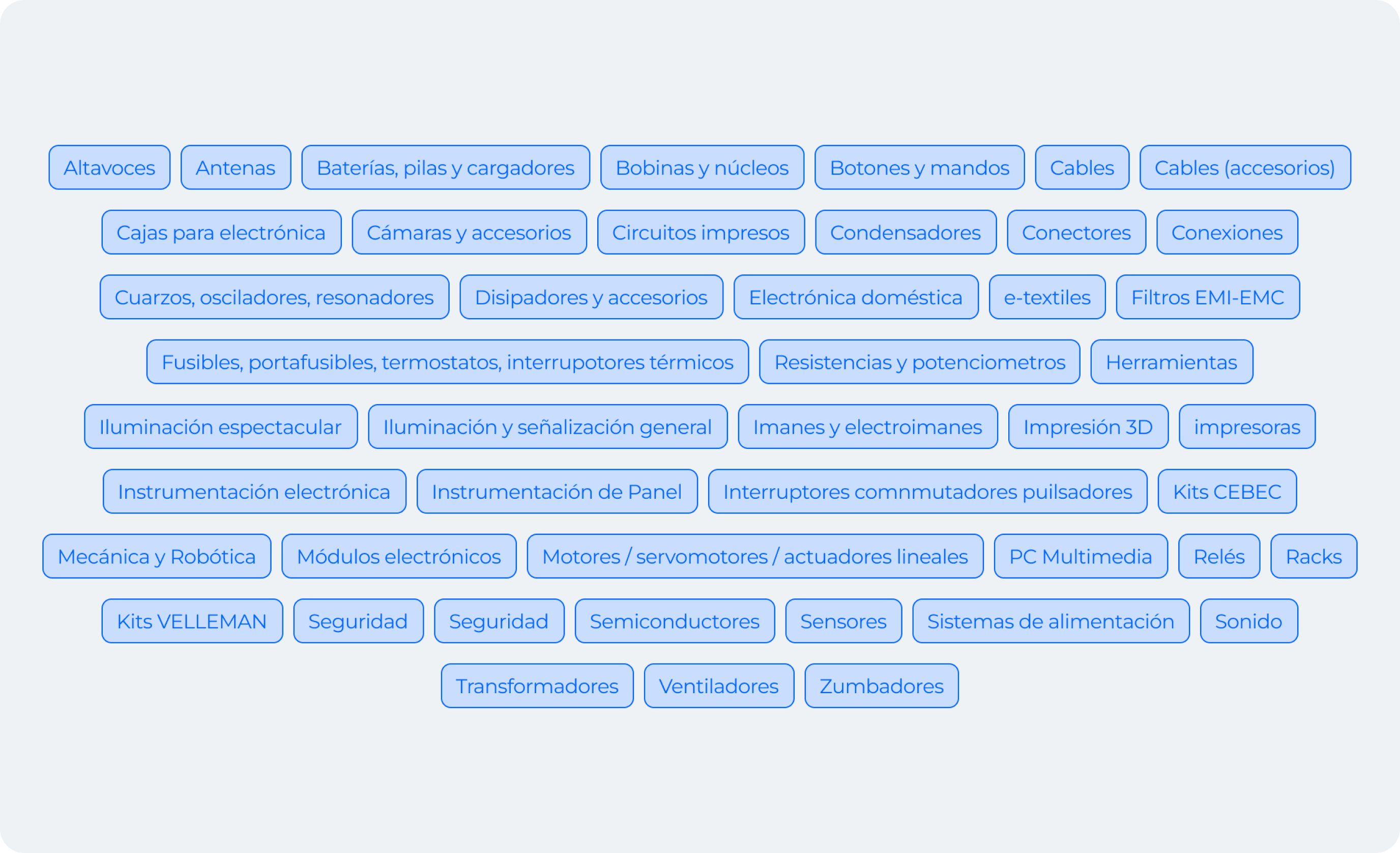
The electronics market offers an overwhelming variety of categories, ranging from mobile devices to smart appliances. This immense variety can confuse users, making it difficult for them to identify their specific needs and find the best products that suit them.
Many potential customers lack the technical knowledge needed to navigate these categories effectively. Without clear guidance or accessible resources, users often feel uncertain about their purchasing decisions, leading to frustration and abandoned carts.
The market is dominated by a few established brands that have strong customer loyalty. These competitors have refined their offerings and marketing strategies, making it challenging for smaller players like Electrónica Embajadores to stand out and differentiate themselves.
By analyzing successful companies within the industry, we can adapt proven strategies and tailor them to our own approach. This enables us to leverage existing best practices while maintaining our unique vision.
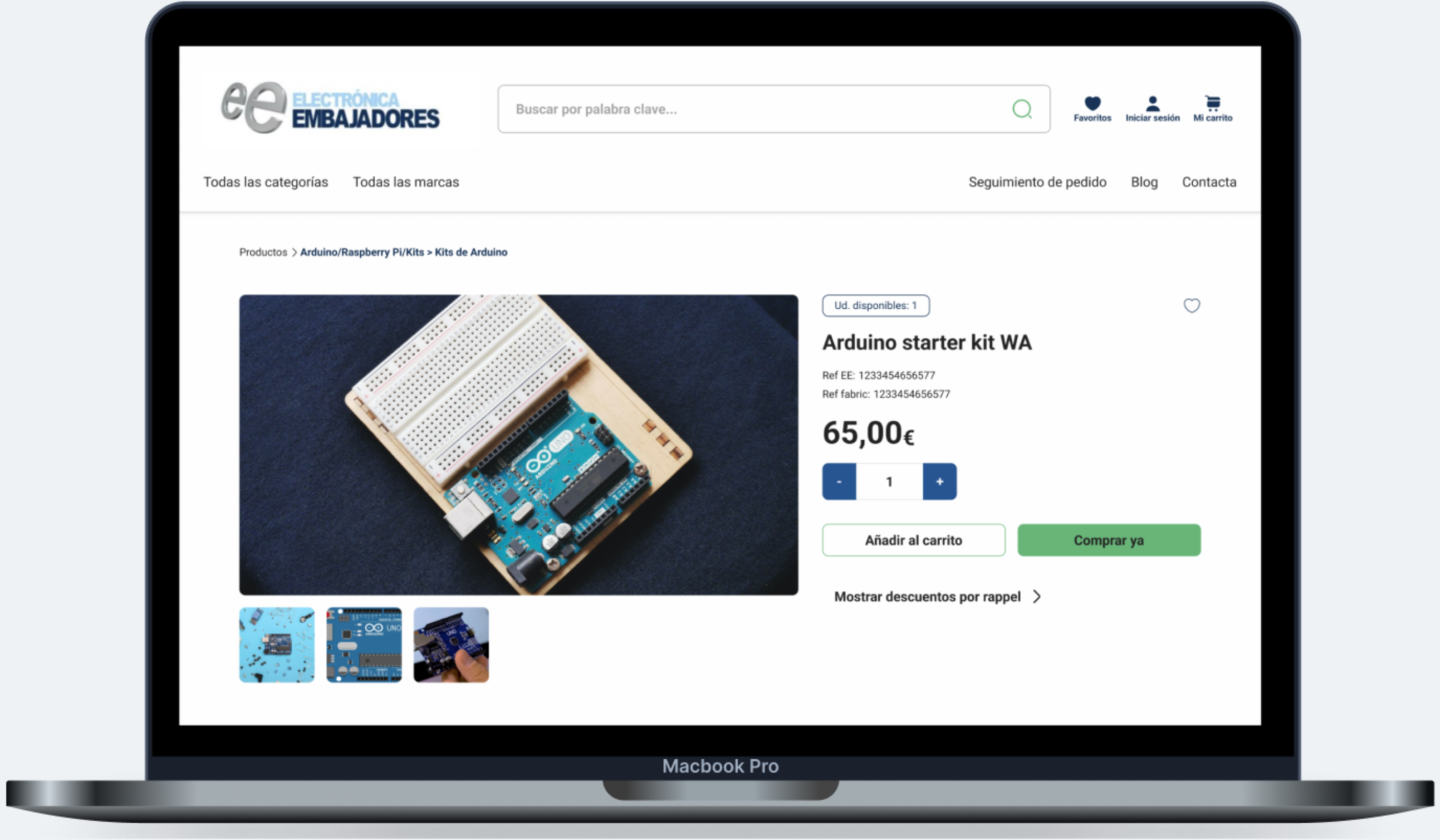
In addition, we followed Jakob’s Law of UX, aiming to maintain similarities with the main electronic portals frequently used by users. This reduces the cognitive load and makes navigation intuitive, as users are already familiar with similar interfaces.
A cohesive color scheme is essential for establishing a strong brand identity. We developed a palette that resonates with our target audience and enhances the overall user experience, ensuring visual consistency across the platform.
Organizing content with a clear hierarchy is crucial for improving readability and navigation. By using varying font sizes, weights, and styles, we guide users seamlessly through the information, helping them find what they need quickly and effortlessly.
Automation: Implement an automated system for utility bill collection and distribution to reduce manual workload.
Notifications: Set up regular alerts for rent and utilities to streamline communication and minimize tenant confusion.
Online Platforms: Centralize payments, bills, and communications to enhance transparency and reduce errors.
Our design must be flexible enough to accommodate a growing product range. We created an adaptable interface that can evolve as the catalog expands, ensuring the user experience remains smooth and intuitive.
Redefining the ecommerce categories is essential for simplifying navigation. We used Card Sorting Technique with real users to develop a logical hierarchy to help users locate products quickly, reducing frustration and enhancing overall satisfaction.
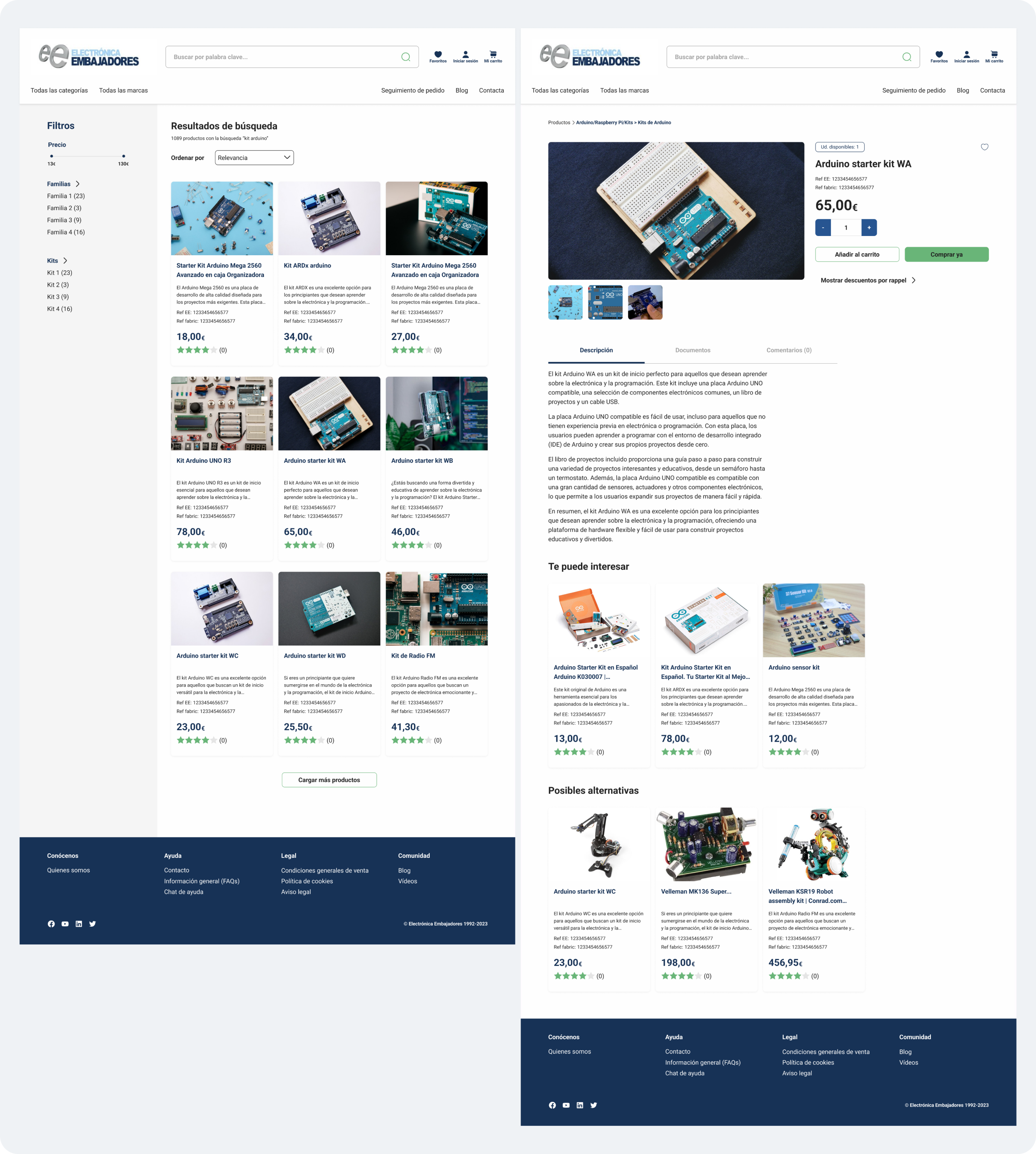
Adding features that suggest related and alternative products enriches the shopping experience. By offering tailored recommendations, we can increase user engagement and drive additional sales.
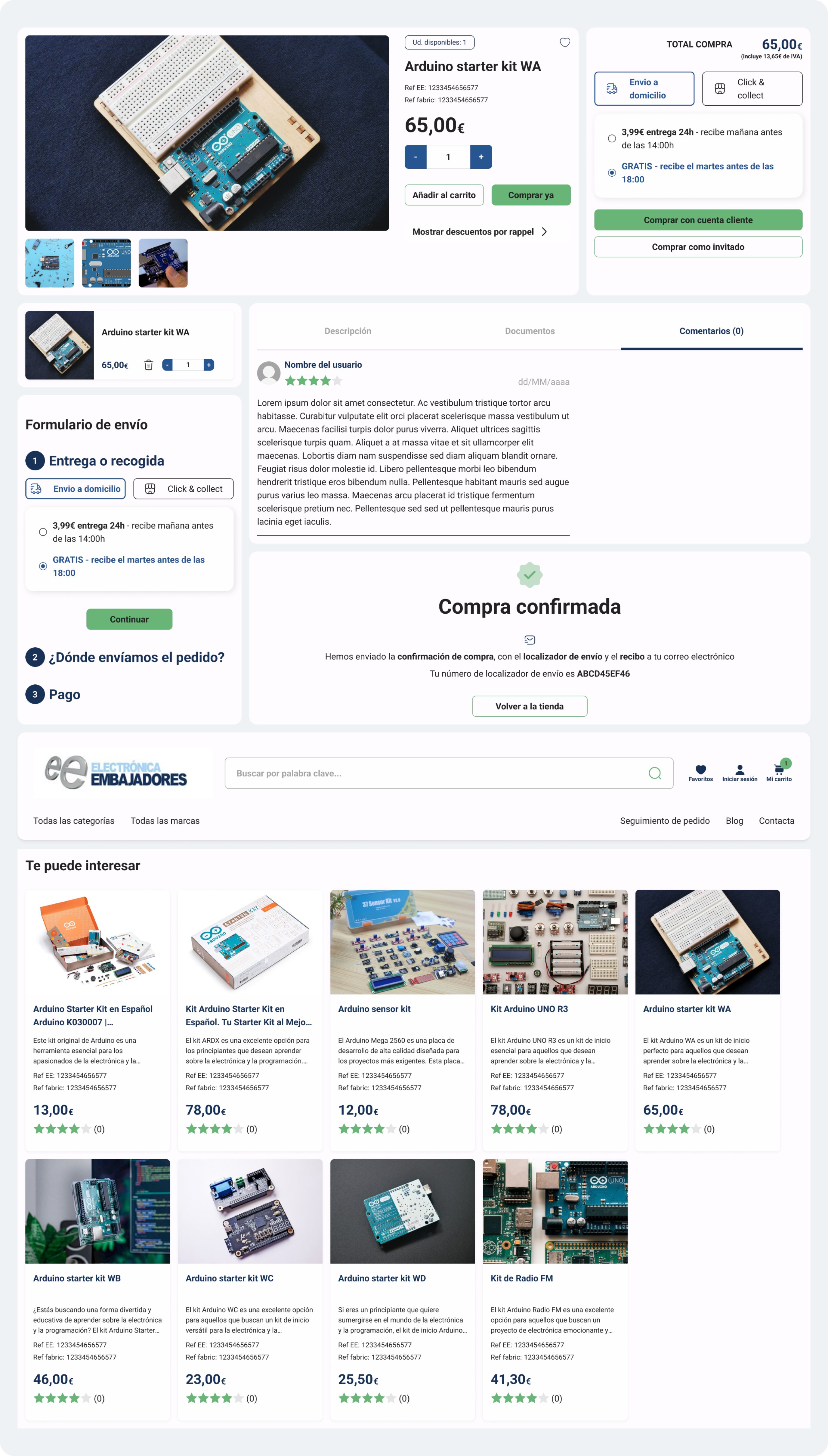
Streamlining the purchase process is crucial for reducing friction and improving conversion rates. We analyzed user feedback to determine the most effective checkout method, focusing on minimizing unnecessary steps and simplifying form fields. We based our decisions on big actors UI like Stripe or Shopify.
I learned a lot from this project about identifying the real needs of the user. Answering why and when users want to use your product is essential for making informed design decisions. This understanding guided us in crafting a user-centric design that meets both the business goals and user expectations.
View prototypes