Teegolf
Teegolf is a meeting point for golfers, designed to help them decide whether to play, and to connect them with others for their games. Teegolf is where golfers go first. It’s where the experience of golf truly begins.
View prototypes
Golfers love the game, but the decision to play often depends on various factors beyond just desire. Golf is not just a sport; it’s a social and leisure activity. People love spending time with friends, meeting new people, competing with themselves, and enjoying beautiful views.
Each game takes an average of four hours, but most of that time is spent walking, talking, and enjoying the surroundings rather than actually hitting the ball. The company of others and factors like the condition of the course and weather are crucial considerations when deciding to play.
During the discovery stage, we found that booking a game was sometimes tedious, even though many people were comfortable with calling the club directly or using online booking in some clubs. However, many small steps had to be taken before making that call. Checking the weather, knowing if the course was well-maintained, and even figuring out who to play with could complicate the process.
This revealed the need for an all-in-one solution that would support users from decision-making through to booking.
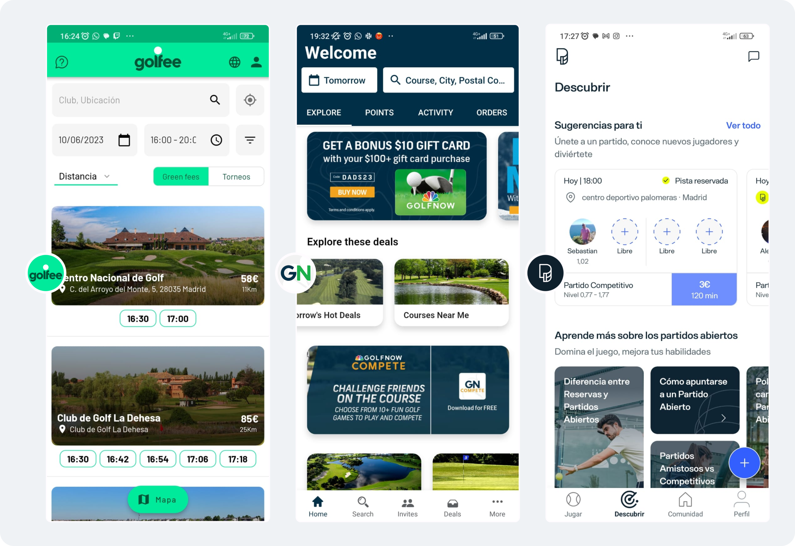
As is often the case, other big players already occupied the market. We analyzed some of the major competitors to understand which user pain points they addressed, helping us identify where Teegolf could add value.
Research showed that the app could fit somewhere between social engagement and booking, blending the best of both worlds to offer a unique experience for golfers.
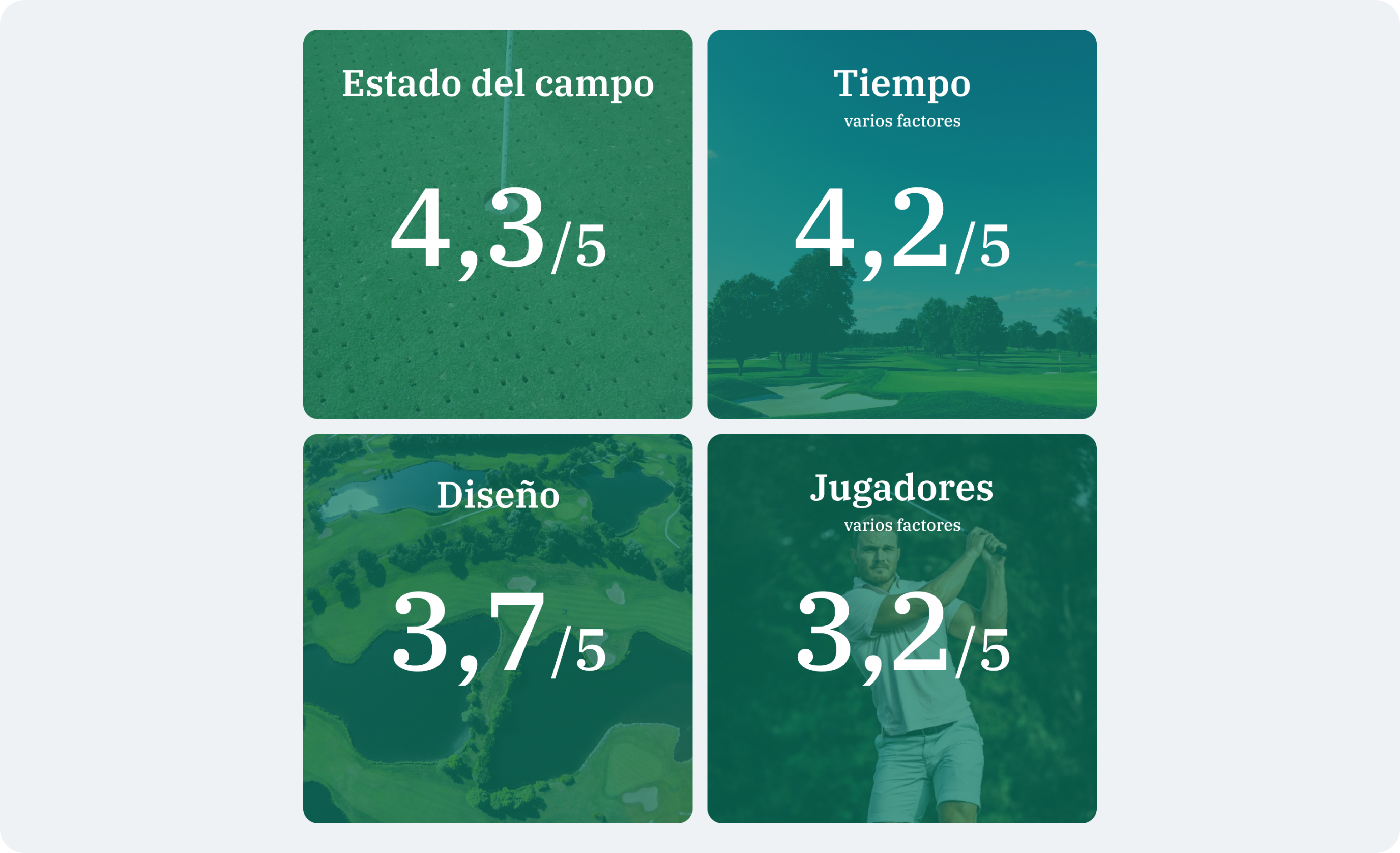
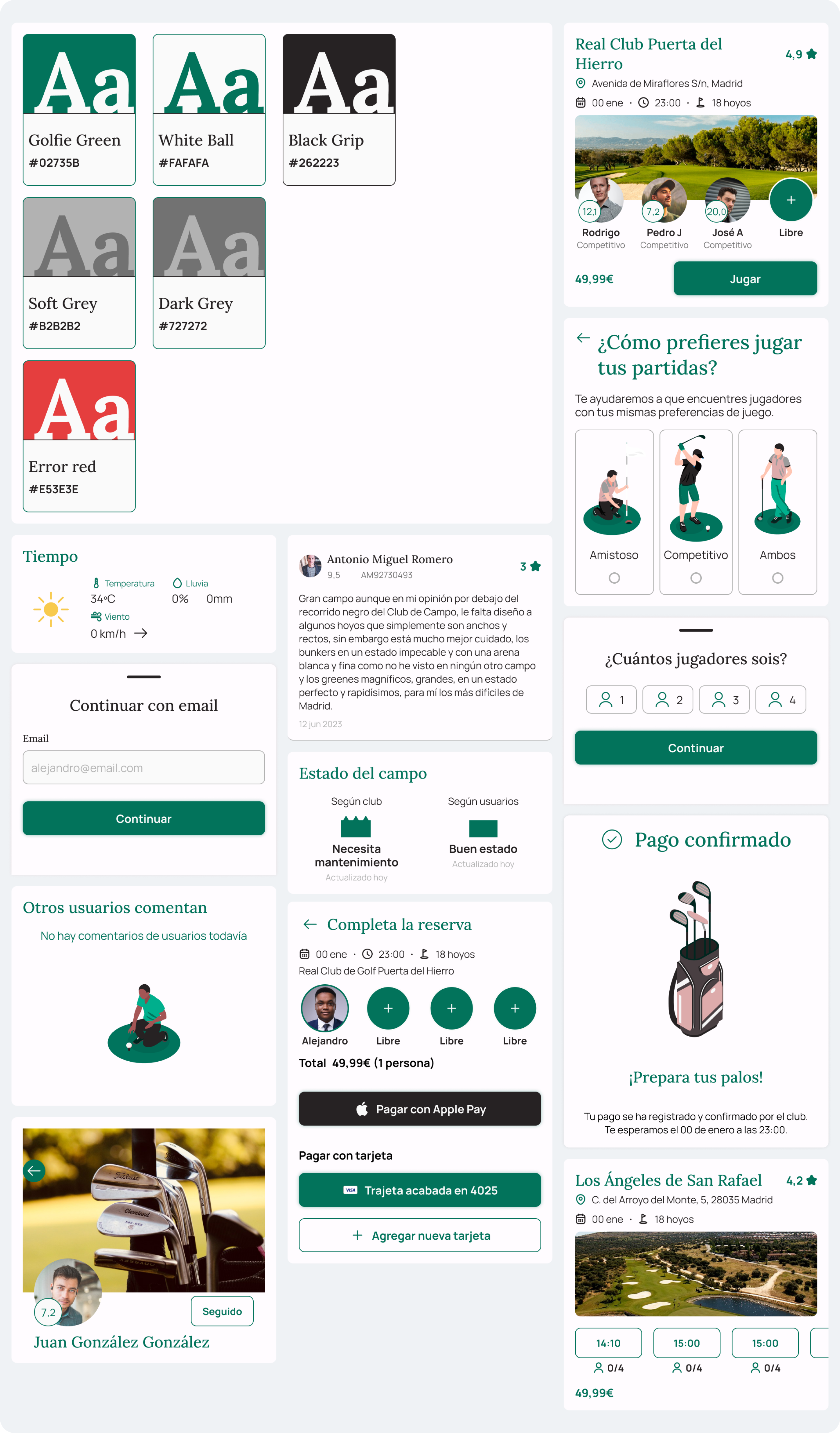
Green maintenance is something users highly value when deciding whether to play. Clubs continually work on improving and maintaining their courses, and sometimes the quality of the game experience is diminished if maintenance is underway.
Another key factor is the weather. Rain or strong winds can significantly impact whether golfers decide to play or not.
When deciding to play at an unfamiliar club, the course’s design becomes a significant consideration. A more challenging course might appeal to competitive players, while others may prefer a more casual experience.
Sometimes, players cannot play with people they know. Knowing who you are going to play with is important when deciding to play. Why? Because a game of golf typically means spending four hours together. Playing is more than hitting the ball—it’s about enjoying the time spent with others.
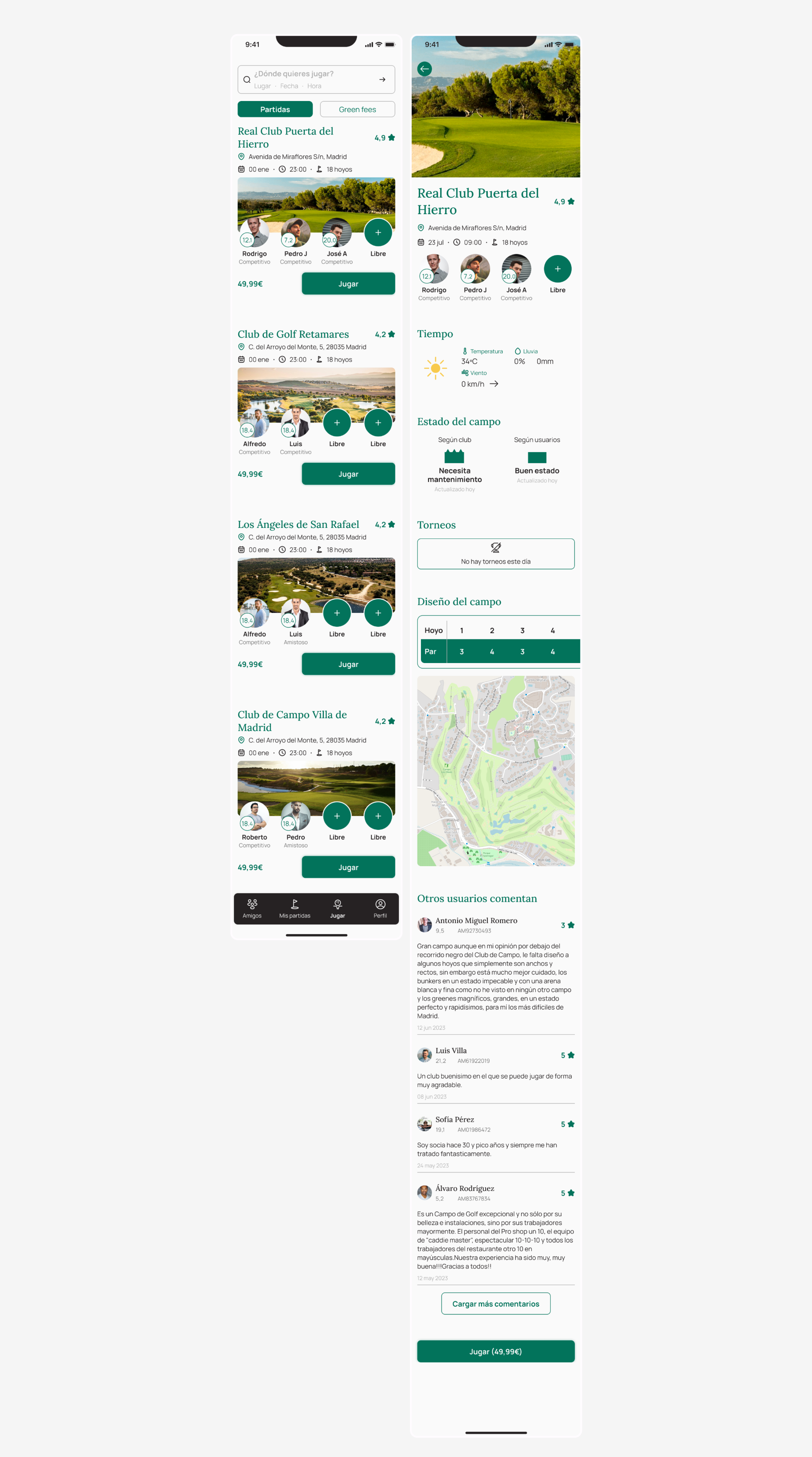
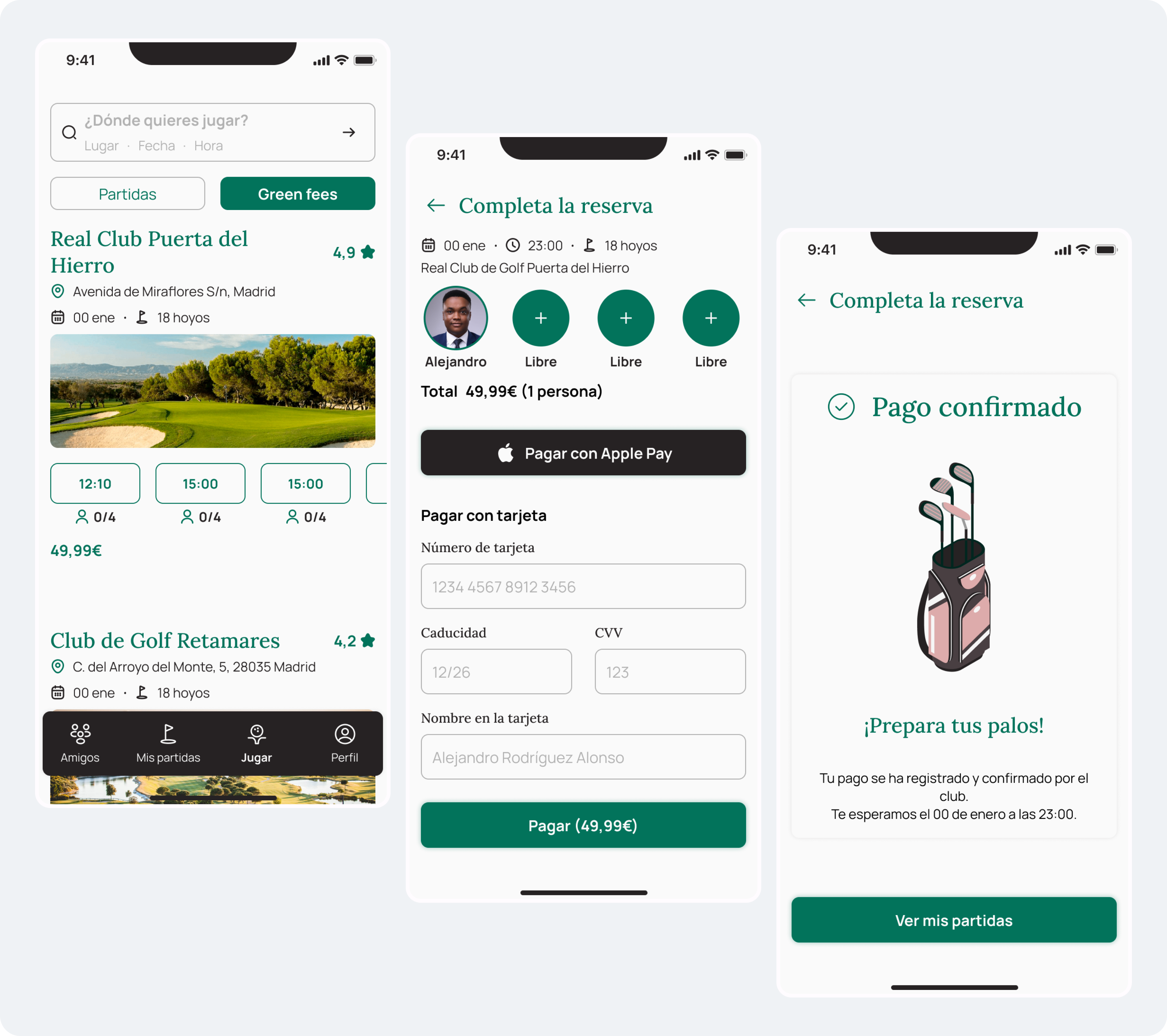
We designed two booking methods based on patterns observed in other apps and competitors. Sometimes players can't find enough people to complete a foursome, while other times they can easily fill the spots. The design needed to accommodate these varying scenarios.
This project marked one of my first experiences in gathering specific user data through a sign-up form. We had to carefully decide which data to include, balancing between thoroughness and simplicity to avoid overwhelming new users.
To encourage engagement, we integrated gamification elements. We used the main scoring metric in golf: the handicap, which we linked to each user’s profile with the Real Federation of Golf of Spain.
We conceptualized the brand using core elements of golf: greens, white, and black as primary colors, complemented by action-oriented images to make the experience more dynamic. In the UI, we opted for a minimalist design to enhance usability and make the app feel approachable and intuitive.
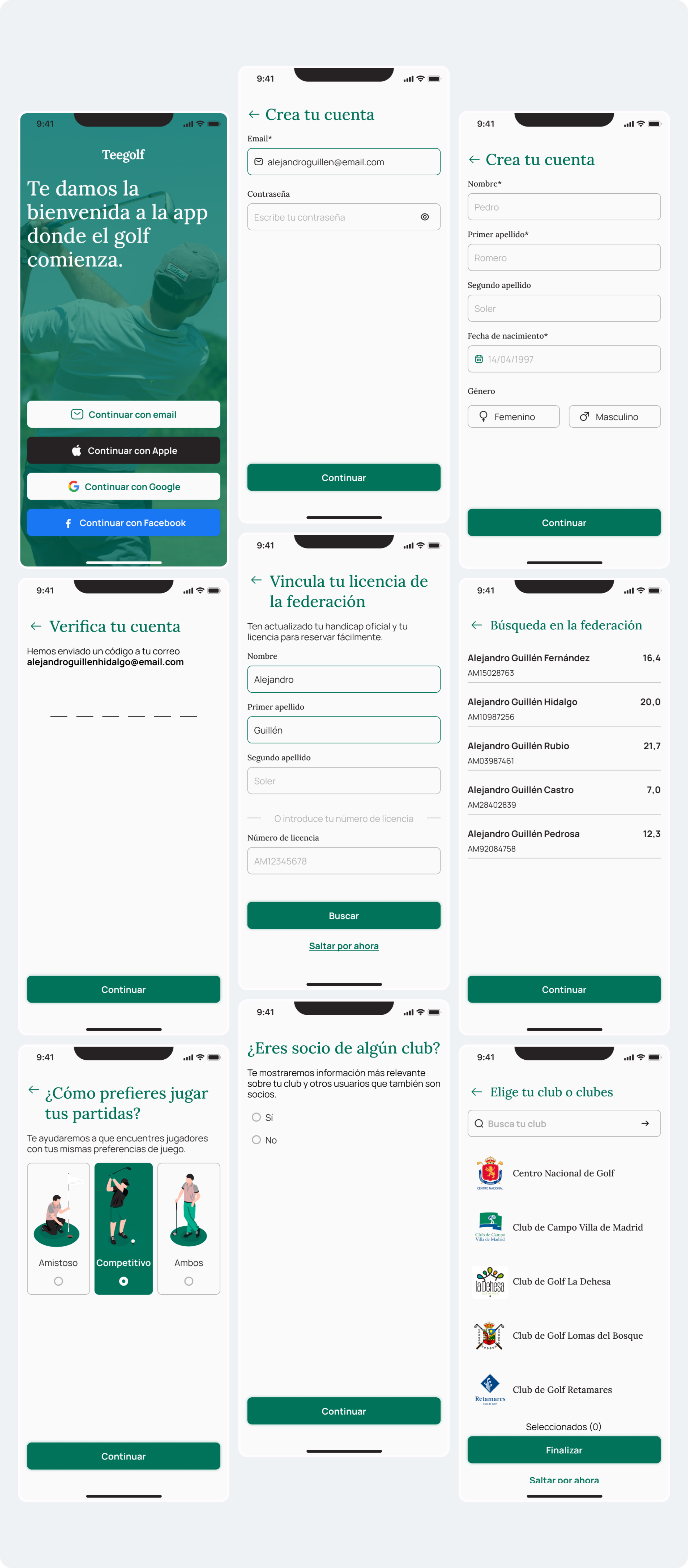
This was one of my first experiences collecting detailed user data through a sign-up form. We meticulously selected each piece of data to ensure it was essential and valuable for the main sign-up flow.
As observed with other competitors, sometimes it’s difficult to fill a group for a full game, while other times it’s easy. We designed flexible booking flows to adapt to these scenarios.
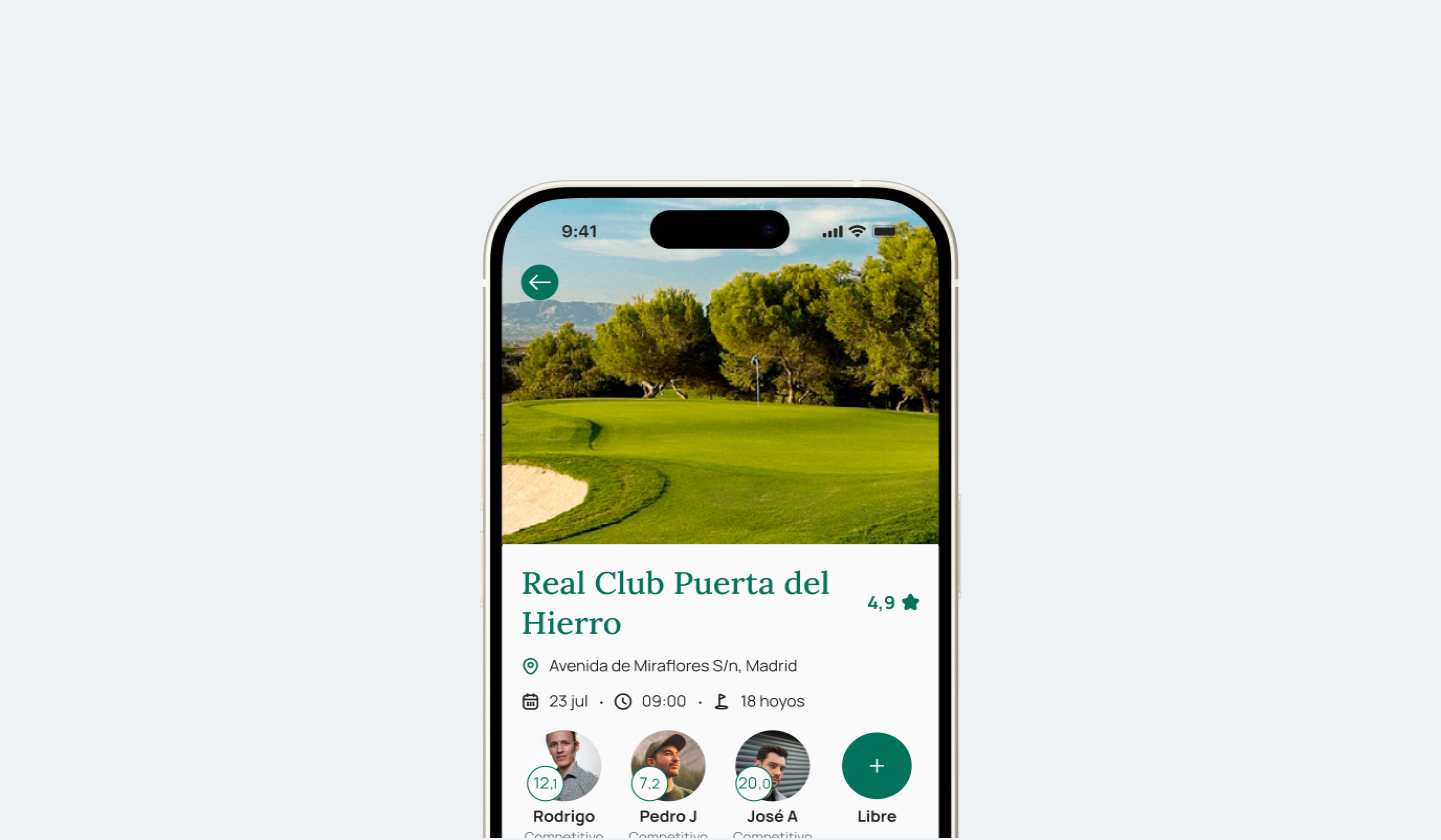
Our research identified key decision factors that influence whether players decide to play or not. We incorporated these into the app’s game details page, so players can see all relevant information before pressing “Book.”
We streamlined the process to make it as simple as possible, aiming to reduce friction and improve conversion rates. It only takes three taps to confirm a game.
We developed a preliminary design system to ensure consistency across screens and to support future product development. After validating the mid-fidelity prototype through testing and defining the key components, we created high-fidelity prototypes along with the design system components.
We prepared detailed documentation for the design system, components, and screens to ensure the design was accurately implemented during production and remained consistent.
This was my first complete design project, where I tackled various user needs and created a comprehensive design system. I also took responsibility for handoff to developers, ensuring the design remained consistent through production.
Designing for a field I wasn’t an expert in was challenging, but it pushed me to research and immerse myself in a new domain. While it’s demanding, it’s also a rewarding experience that allows you to learn while working.
View prototype